en building a brand, there’s nothing more important than your logo – and no one wants to look dated or like they used a logo maker. That means more experimentation with on-going trends, the resurfacing of classic styles and a few new surprises along the way. Without further ado, here are the 2016 logo design trends we’re sure you’ll love this year.
1. Dynamic color palettes
The 2015 Google rebrand could be called the shot heard ’round the world in the design industry. Most notably they solidified the color scheme into a dynamic and functional color palette.
Dynamic design isn’t necessarily new – we noted it as one of the big 2015 logo design trends. But since Google is one of the most identifiable brands out there, it would be no surprise to see dynamic color palettes saturate the mainstream even more in 2016.
2. Authenticity
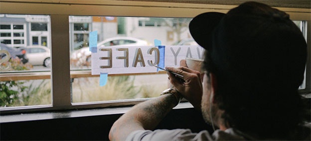
Vintage or old-school logos will likely pervade coffee shops and small businesses for the foreseeable future. But how do you keep such a long-term trend current?
2016 will be the year of more refinement, minimalism, balance and simplicity. Designers will take yet another step towards nostalgia, mimicking an era that was limited by creative tools. Prepare to see logo designs inspired by sign painters and fabricators that emphasize authenticity through handicraft styles and simple, stripped down designs.
3. Mix & match
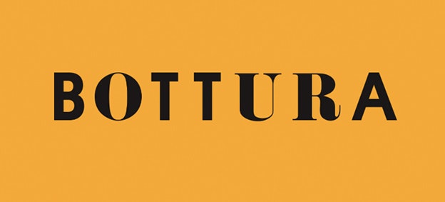
One logo design trend we have yet to see in a sophisticated or progressive way is the mixing and matching of typefaces. While this practice was well exercised by Paul Rand in his day, the technique is only now beginning to resurface, indicating that designers are finding creative new ways to utilize this style – and escape the ransom note connotations.
Mixing and matching can speak to many concepts, including playfulness, up-cycling or (as used in the Italian restaurant example above) a clever cultural melting pot.
4. Minimalism
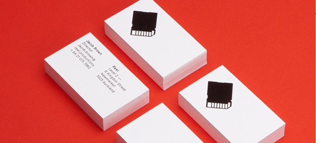
Flat design could be considered old-hat at this point. However, there are still designers out there using it in new ways.
Take for example Richards Partners, who created this design based off of the shape of an SD card. By taking the shape and flattening it into a single color print, they were able to create something that toes the line between abstract and recognizable. The result is eye-catching and makes you think for a second. In 2016 we’ll see designers continue pushing and experimenting with the definition of flat design.
5. Background textures
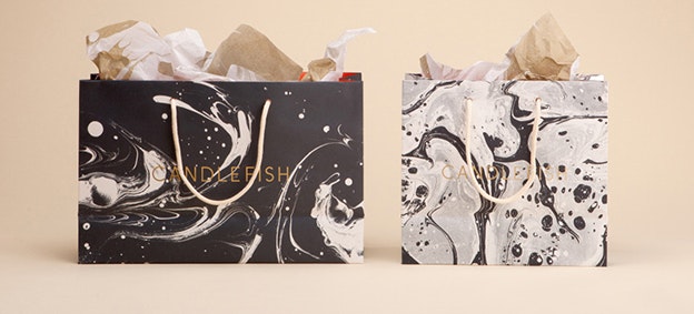
Candlefish by Fuzz
A more recent occurrence in logo & identity design is the use of photographic textures. An offshoot of dynamic design, this upcoming trend dresses up a minimal logo with an eye-catching and easily changeable set of textures for a chic finish.
The Candlefish logo above utilizes this trend by adding an additional layer of interest to a logo that might feel incomplete on its own. As with most techniques that are new and successful, chances are we will see much more of this in 2016.
6. Awareness of scale
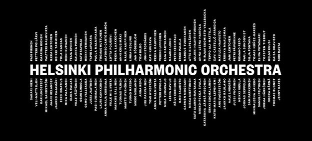
The contrasting font sizes in the above branding for the Helsinki Philharmonic Orchestra create a large visual scale that corresponds to the physical scale of an orchestra. This awareness of scale is something more recent and, as more designers utilize this principle in branding, we may see more logos that connect the visual scale of the design to the social or physical scale of the client.
7. New typographic parameters
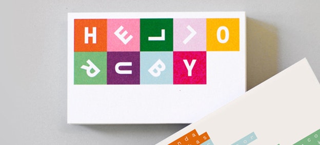
Hello Ruby by Kokoro & Moi
Another technique that was once familiar to Paul Rand and largely foreign to designers today that’s resurfacing is typographic rotation. The Hello Ruby logo uses this technique in a way that is playful yet professional. Chances are there will be more logos like this to come!
8. Geometry
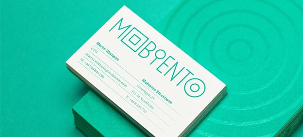
Geometry has always been a thread running through design history. With that said, in more recent years it has been surfacing in new and innovative ways. Ideal for hipper boutiques, this trend emanates a contemporary “coolness” that is at once creative, minimal and sophisticated.
In the Mobiento logo above, letterforms are broken into basic geometric elements such as circles and squares. The circles draw the eye in while the shapes as a whole act as a decorative solution to an otherwise too-simple wordmark.
9. Wordmarks
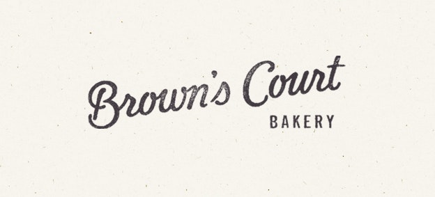
The wordmark is a timeless logo format. It is a self-contained package that inherently does what most dynamic logos or logo sets do; it carries with it the visual language of the client wherever it is placed.
With the movement towards digital-first design, we will undoubtedly see even more wordmarks in 2016. Less distracting than more illustrative styles, these types of logos effortlessly blend into websites, apps and dynamic sets – as well as offering better scaleability than more complex designs.
10. Line art
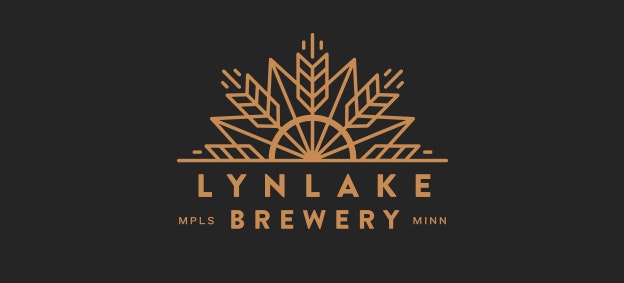
Breweries, coffee shops and other hipster hangouts are going gaga over the line art trend (also known as monoline). Taking decorative cues from the hipster badges of yesteryear and iconography, this new style emphasizes clean lines and line thickness in a beautifully minimal way.
The Lynlake Brewery logo makes a solid effort in using line thickness to create a cohesive visual language. It’s an aesthetic style we’re sure to see plenty more of this year.


