When working with spreadsheets, it’s important to take raw figures and turn them into a story. Today’s update to Google Sheets on the web allows people to do just that, offering even more ways to visualize and analyze data.
Customized charts, made easier
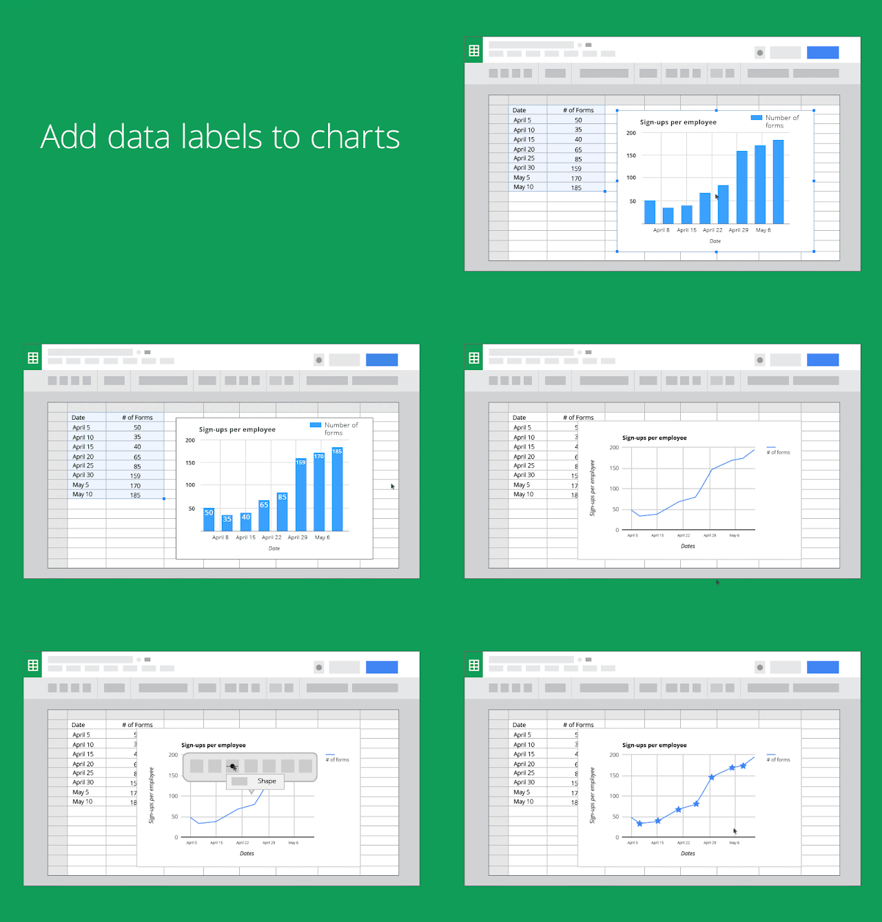
- Use data labels to display the exact values of bars and points in charts.
- Choose different shapes and symbols for data points in both line and scatter charts.
- Move and resize charts more easily.
Data, displayed right
Today’s launch also includes new tools for analyzing spreadsheet data. For example, people can:
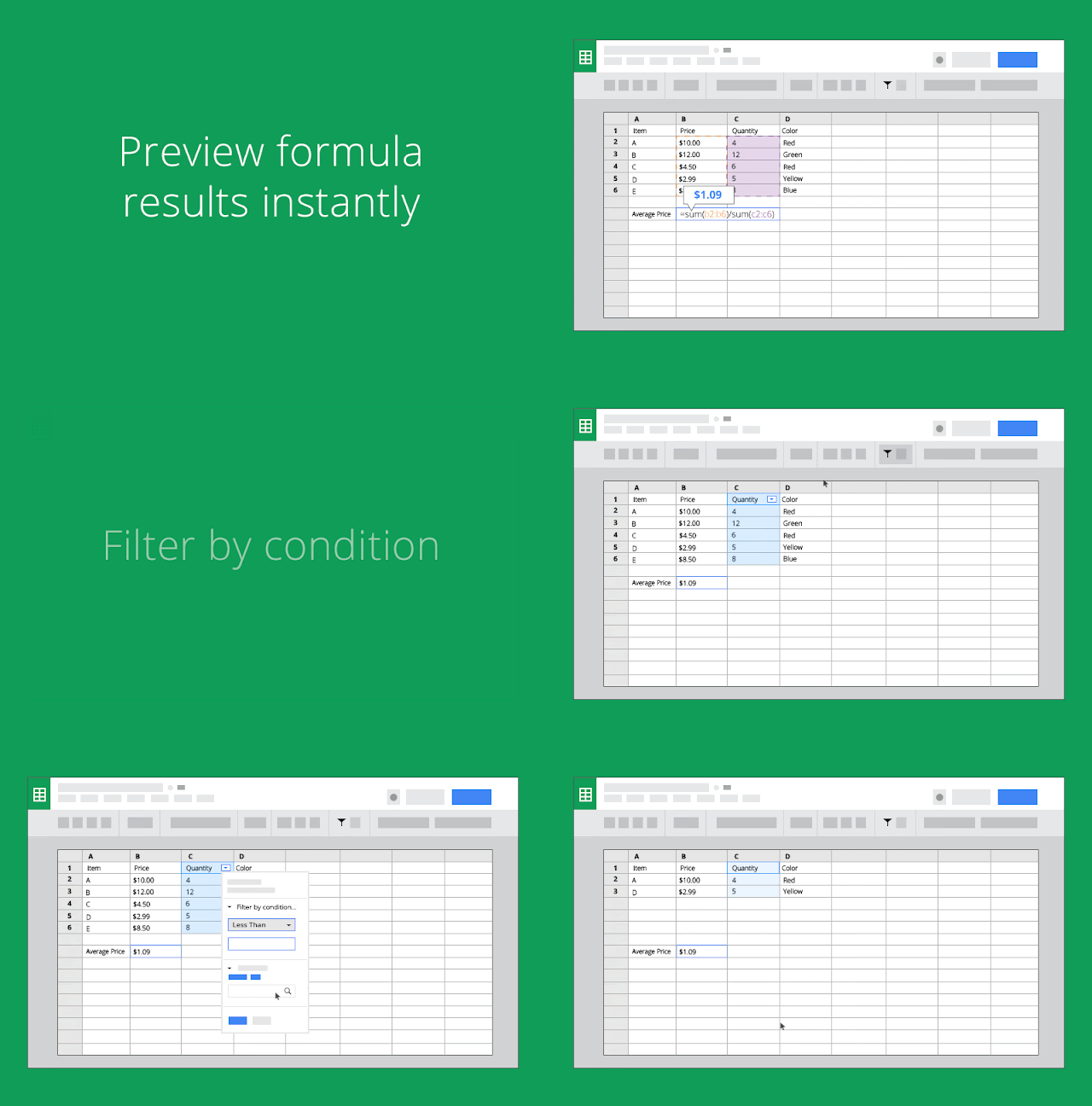
- Preview the results of a formula, including any formula errors, instantly as they type.
- Filter rows and columns by conditions, including “less than,” “greater than,” “text contains,” “date after,” and more.
- Add calculated fields to pivot tables in order to apply formulas to pivot table data.
- Use the GETPIVOTDATA function to retrieve data from a pivot table.
Collaborate, confidently
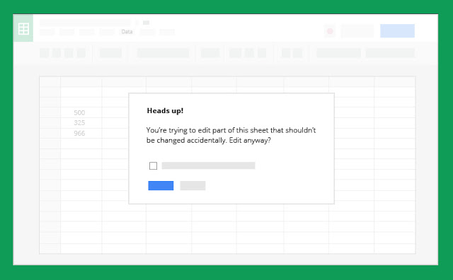
Collaborating in Sheets can greatly improve the end product, but it’s important to avoid making accidental edits. Currently, people can restrict who can edit an entire worksheet or range of cells using the protected sheets and ranges feature. To reduce the number of unintended changes (e.g. typos) made by people who do have permission to edit, today’s launch includes the ability to warn individuals who attempt to edit certain cells. This will facilitate increased collaboration, as owners won’t need to set complicated permissions in order to allow others to work on the document.


