Ever wished your lame-ass blog could look a little more like a sweet, crisp Material Design app? Well, it’s your lucky day: Google has a new tool that will do most of that work for you.
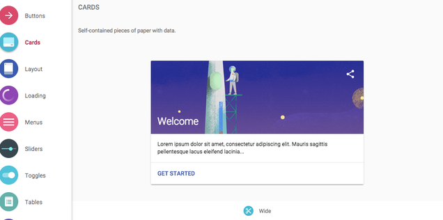
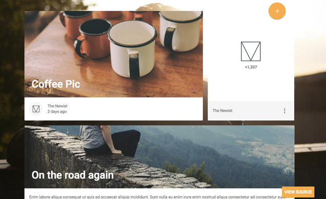
On Medium yesterday, Google Developers introduced us to a useful little tool called Material Design Lite. In simple terms, it’s a library of components that will make it very easy to apply Material Design elements to standard old HTML, JavaScript, and CSS. The library includes all sorts of page elements: Cards! Click-sensitive menus! Gem-toned buttons! Lovely little physics-enhanced toggles! “If you just want to pick some colors, customize a template and ship a Material experience, we try to help make that process simpler,” the team explains.

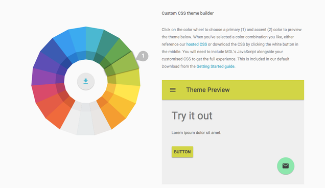
There’s also a lovely little theme builder for CSS that revolves around a paint-chip color wheel, and a series of web layout templates, too.

It’s definitely no surprise that Google is interested in bringing its brand-name design language to the web at large. It’s been leaking into the internet for more than a year now—first through Android apps, then into web apps, and now, into the web itself. Back when Google first showed us Material Design, Gizmodo’s own Brent Rose interviewed Google VP of Design Mathias Duarte about the design syntax. He basically told us about Material Design Lite, though in not so many words:
It wasn’t just a problem about going beyond phones and tablets, which was clearly something we wanted to do—we wanted to design for all these different screen sizes… So we wanted to build a world that had a material, and the material was just physical enough to help users, to create hierarchy and to provide affordances. We wanted the world that we built to be continuous and have physics and motion just like the world around us.
In other words, this has been the plan all along: a web that looks as crisp, clean, and chromatically coordinated as Google’s design team ever dreamed. As long as you don’t mind copping to their own vision of good design, you can check it out here.


