Article written by Melina Stathopoulos.
The next time you log in to FreshBooks you’ll be greeted with a sharp-looking start page – meet the new Overview. We’ve collected lots of great feedback from you about this page and we know how important it is to be able to get a high level view of your business, at a glance. The Overview is easier to read and interact with plus all your key information is now gathered together, front and center. It’s like a snapshot of your whole business as soon as you log in.
What’s new?
The first thing you may notice is changes to how your account information is presented. Dashboard-style panels show you the current status of different aspects of your FreshBooks account including invoices, expenses, time tracking, staff/contractors and more. These interactive charts and graphs provide a high-level overview of your account details, and key figures are presented more visually.
If you want further details on anything you see on the homepage, you can roll over for additional insights without having to leave the page. This improved navigation aims to cut down the time you spend clicking around to get a complete picture of your business, and lets FreshBooks capture it for you. And for all you multi-taskers, you’ll also find shortcuts to the things you use the most like creating a new invoice, estimate or time entry. Here’s a short tour:
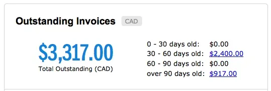
Outstanding Invoices – the overall picture of what’s owed
“Total Outstanding” shows the total value of any outstanding invoices. Simply click on the currency (in this example, CAD) to change it; your preference will be saved. The “0 – 30 days old” links are a standard accounting format for assessing how long you’ve been awaiting payment. By clicking the dollar amount you’ll visit the list view of your unpaid invoices.
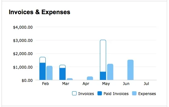
Invoices and Expenses Bar Chart
This is a stacked bar chart that shows the value of invoices created in a given month, and as you receive payment, the invoice bar appears to fill up to show accrued value of those payments. Roll your mouse over each set of bars to see important info including: exact value of invoices created that month, amount of outstanding payments, exact value of expenses and any rebillable expenses yet to be applied to an invoice.
The Expenses bar is not stacked, it simply shows the total value of expenses created that month (note: an asterisk appears if there are unbilled client expenses for that month).
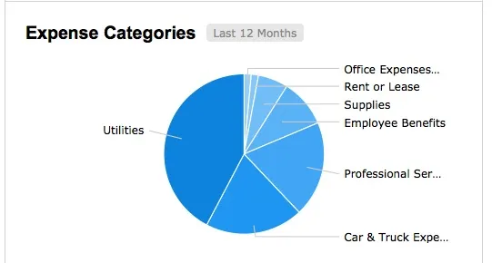
Expense Categories Pie Chart
Hover over any part of the Expenses pie chart and you’ve see expenses are broken out by category and date range. Clicking the link will also take you directly to the list view of those particular expenses.
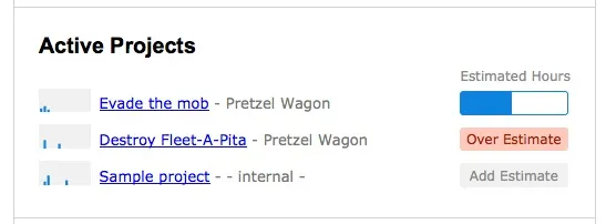
Active Projects (previously known as the Project Dashboard)
This area shows all of your Projects that have not been archived or deleted. The small box appearing on the left side of each project is actually a spark graph – a really tiny scale of activity from the last two weeks. If you have recently been logging hours to a Project you’ll see little activity bars are added to give you a visual cue on where you are spending the most of your time.
Use the “Estimated Hours” progress meter to gauge total time budgeted for a project. As time is tracked against the project budget, the meter is filled. Note: Projects without budgets do not show a progress meter, instead you’ll see an “Add Estimate” button that allows you to create a budget in-line, without navigating away from the page.

