Want to know how to Serve Scaled Images and Optimize Your Images? We’ll show you how!
As a conclusion to our What Does Optimizing Images Mean? post, we’ll show you how to actually solve your image optimization woes. This walkthrough is general enough to apply to most websites and platforms.
NOTE: This is just one way to scale and compress your images. There are many other methods that would work just as well.
Here’s how to get your images scaled and compressed.
Step 1) Analyze your site with GTmetrix
When the report is complete, look at your PageSpeed tab and click on “Serve scaled images”
The section will expand and show you a list of images that need to be scaled.
Click on the Serve scaled images recommendation to see a list of images that need scaling.
In this example, we’re serving an image that’s 2000×1095, but being scaled to 524×287. We can reduce the filesize significantly if we serve a more appropriately sized image.
Take note of the image name, and find where it’s being displayed on your site.
Step 2) Find out the maximum display size of the image
In other words, determine how large that image could potentially get.
Most likely, your site is responsive. You’ll need to figure out what size the image needs to be served at.
Resize the browser (In this guide, we’re using Chrome) and take note of “break points” where your image resizes suddenly.
The sudden resize in your image indicates a “break point.”
Many responsive themes have multiple break points, so keep doing this until you see the largest size the image is displayed at. Generally speaking, this is the maximum size your image needs to be. To find out exactly what pixel dimensions it is:
Right-click on the image and click “Inspect” (“Inspect Element” in Firefox and “Developer Tools” in Edge)
“Developer Tools” will appear, and the code for your image will be highlighted, and if you hover over the URL, you’ll see the dimensions it’s served at, and it’s “Natural” size.
Hover over the highlighted URL of your image and you’ll get the scaled size and Natural size of your image. Above example using Chrome.
The “Natural” size is the actual dimensions of the image. This is what your users are downloading.
Take note of the first dimensions you see (in this case it’s 628×344) – we’ll call this the maximum display size.
Important things to note
- If your image always follows the browser resizing, even at a maximized screen, it means that image is likely within a container that has no maximum display size.
- The best thing you can do is export at your best perceived quality and compress the image for filesize savings.
- This image may trigger the “Serve scaled images” recommendation, but unless you change your site design to have a max-width, you cannot address this issue.
- If the image doesn’t change size when you resize the browser, it means it’s likely already at its maximum display size
- Take note of those dimensions and rescale your image accordingly.
- If you cannot find your image URL, it means it’s most likely a background image (displayed via CSS) or JavaScript is doing something with it.
- Using the “Inspect” function, check the CSS panel to see if your image was placed there via “background:”Use the Inspect tool to get details for background images.
- Click on the container that the image is displayed in – in this case it’s
<header class=”blog-header”>…</header> - Look to the right and you’ll see the class “blog-header” having a “background-image” – You can confirm this is indeed the correct image by right clicking on the URL and opening it in a new tab.
- Take note of the container size (yellow) on the screen – in this case it’s 683×166 – These are the dimensions you’ll rescale your image to.
- If you’re using WordPress, you may see “srcset,” along with a list of image URLs.
- Later versions of WordPress automatically use “srcset” to deal with overly scaled images.
- You shouldn’t need to do anything here, as the WordPress theme should deliver different sized images at different screen resolutions.
- We’ll likely discuss “srcset” in a separate article. For now, you can read more about “srcset” here.
Step 3) Resize your image to the maximum display size
Use a photo editor (Photoshop, GIMP, etc) and resize the photo dimensions down to the maximum display size.
Use an image editor to resize your image to the maximum display size.
Export your image for the web, depending on the type of graphic:
- Photos and colourful, high detail images – Use JPG.
- Adjust the quality percentage to what you feel is acceptable.
- Logos and basic graphics with few colours or transparency – Use PNG.
- PNG is a lossless format, so there are no quality adjustments to make.
Important things to note
- If you want to ensure maximum quality for retina displays, you can opt for 2x the maximum display size dimensions.
- For example, an image with a 400 x 200 maximum display size, you could resize an image to 800 x 400.
- This may still trigger the “Serve scaled images” recommendation however, due to GTmetrix’s analysis viewport of 1024×768.
Step 4) Compress the image
Image editors don’t do the best job of compressing images, so we need to run our images through a compression tool. The best ones we like are:
Image optimizers like Kraken offer services for free!
Upload your uncompressed images with these free-to-use tools and download the resulting optimized versions. You’ll notice a substantial decrease in filesize.
From 90.65KB to 38.12KB – 57.95% smaller than the original!
Note: You can also use the optimized images GTmetrix generates when expanding the “Optimize your images” recommendation, however the above tools have far more advanced compression algorithms and can save you even more in filesize.
Step 5) Replace your unoptimized image with your newly optimized one
The image you optimized is now resized and compressed – be sure use it as is and not apply any CMS-level alterations to it. This might include inserting it at CMS-defined size or cropping it from within your CMS – more on this here.
In WordPress for example, use “Full Size” instead of the pre-generated media sizes.
Replace or reinsert your images at original or full size in order to retain the optimization you did on the image.
Run another GTmetrix analysis on your page and you’ll find that you now score better on “Serve scaled images” and “Optimize your images” recommendations!
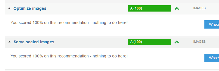
Properly scaled and compressed images will disappear from these recommendations.
Using WordPress? Use Piio!
Piio is a great image optimization solution for WordPress, as it not only compresses your images, it also resizes them, serves them via CDN and adds lazyload!
Best of all, it’s free for up to 1gb of transfer per month – and works great for the majority of WordPress users looking to optimize images. Here’s how to get started:
Step 1) Download and Install Piio
Search for “Piio” in the plugins directory.
Search for Piio from your Plugins page, install the plugin and activate it.
Step 2) Visit the Piio plugin page
Piio will appear in the left sidebar upon activation.
There will be a new option in the left side bar called “Piio” – click on it to access the Piio plugin page.
Step 3) Sign up for a free Piio account
You’ll need a Piio API key for this plugin to work, so visit https://piio.co and signup for a free account.
Visit https://piio.co and sign up for a free account.
Once you’re logged in, enter the domain name where your WordPress blog is installed – click Create.
Enter your domain where your WordPress platform installed.
You’ll then have an API key generated for your domain name.
Your Piio API key will be generated here.
Step 4) Configure your Piio plugin
Copy your Piio API key and paste it into the “Api Key” field in the Piio WordPress plugin.
Paste your API key into the Piio WordPress plugin.
Then, ensure your settings match the below screenshot:
Ensure your settings are as seen above. Click Save Changes when complete.
Notes on certain options
- Optimization
- The Standard option is best for compatibility, but you may yield better compression results with Advanced beta. We recommend you stick with Standard to ensure nothing conflicts.
- Lazy Loading Mode
- This enables Lazy Loading of your images, essentially delaying image loading only until you scroll within the viewport. Again, you may yield better performance increases with Strict, but Friendly would be best for compatibility.
- Script Position
- You can select where to place the Piio plugin scripts in case there are conflicts with other plugins. Leave it on Body End if there are no issues.
That’s it! Piio will automatically perform the following on your images:
- Compression
- Images will be run through compression to reduce filesize without any visible degradation in quality – improving the Optimize images recommendation.
- Images will be run through compression to reduce filesize without any visible degradation in quality – improving the Optimize images recommendation.
- Resizing
- Images will be served in their scaled form, relative to the viewport – improving the Serve scaled images recommendation.
- Images will be served in their scaled form, relative to the viewport – improving the Serve scaled images recommendation.
- Served via CDN
- Images will be processed and routed through Piio’s CDN – improving the Use a Content Delivery Network (CDN) recommendation.
- Images will be processed and routed through Piio’s CDN – improving the Use a Content Delivery Network (CDN) recommendation.
- Applying Lazy Load
- Images will be lazy loaded, meaning they will only load when within the browser viewport – improving the Fully loaded time, Number of requests and Total page size.
- Images will be lazy loaded, meaning they will only load when within the browser viewport – improving the Fully loaded time, Number of requests and Total page size.
Common problems and questions
Q: I optimized images and re-uploaded them in WordPress / Magento / other CMS; why are the images are larger than before?
A: This is due to your CMS regenerating the photo either at a different size or by cropping. When you upload a photo in your CMS, it likely goes through processing to generate different sizes for use as thumbnails or small/medium/large sizes in your content. Even if your original image was optimized, the CMS reads it as any other image, does its processing, and generates a new image without compression.
If you’re using WordPress, a plugin can be used to optimize your Media Library, including the WordPress generated images. We recommend WP Smush, which features automatic optimization of uploaded images, and a bulk optimization feature for existing images.
Q:Will optimizing my images decrease the quality of them?
A: If you losslessly compress your images, no. Lossless compression is simply reorganizing your image data into a more compact and efficient form. No image data is lost. Combined with stripping out extraneous unseen metadata, your images will not have any difference in quality, down to the byte.
If you utilize lossy compression, yes. But by using the advanced optimization tools mentioned above, you’ll likely not be able to tell the difference. In its basic form, these tools use advanced algorithms to strip near identical image data such that it is imperceptible from the human eye. Your images will lose data, but you (and your users) cannot tell the difference.
Q: I optimized my Media Library images using a plugin; Why am I still not scoring well on the “Optimize your image” recommendation?
A: There are a few things that could be happening:
- The unoptimized images are from your plugins
- If you’re using a plugin that displays an image, that image isn’t being served from your Media Library, but rather from your plugin directory.
- You can either configure your image optimization plugin to optimize images in your plugin directory, or manually optimize them using the above tools.
- The unoptimized images come from third-party resources
- Third-party resources are not hosted on your server and therefore cannot be optimized in any way.
- Best to minimize usage of these images.


